
Case study 02 · PlaninGo
PlaninGo.ai
An AI-assisted travel platform that covers the whole trip: planning, searching and booking flights and hotels, managing the itinerary, and what happens after checkout.
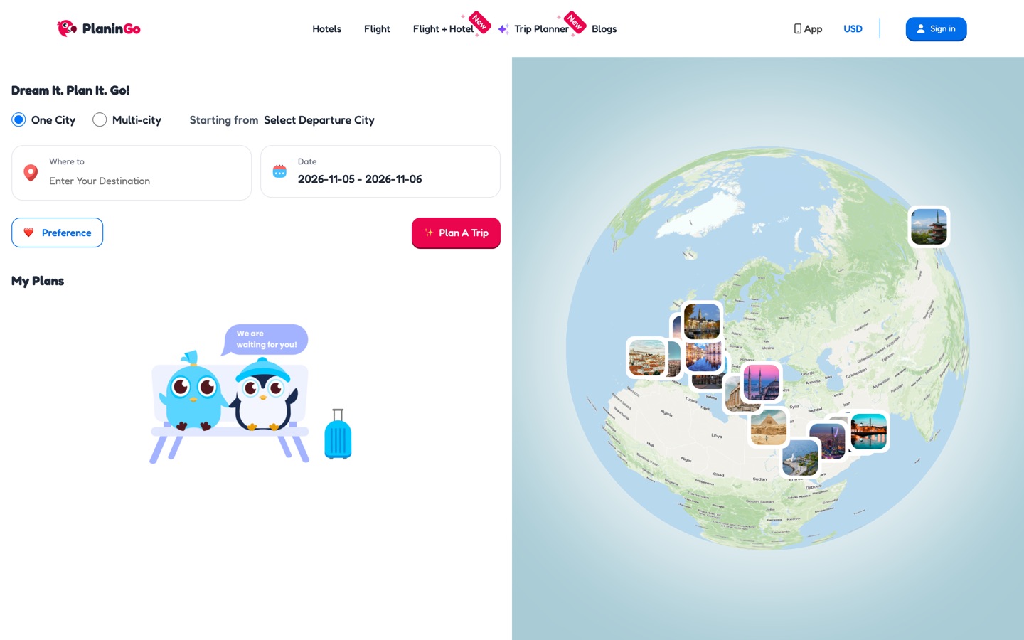
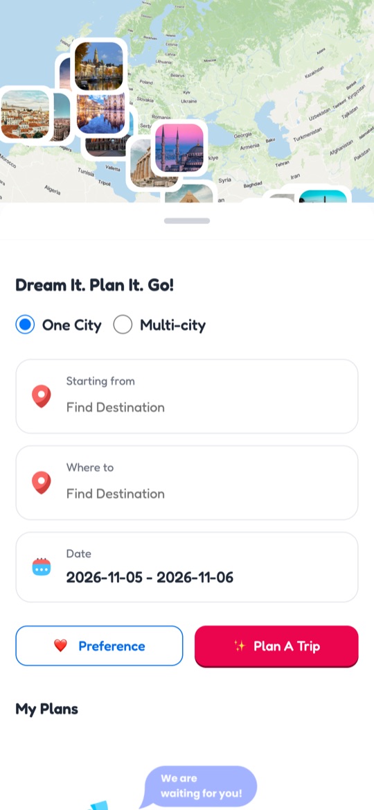
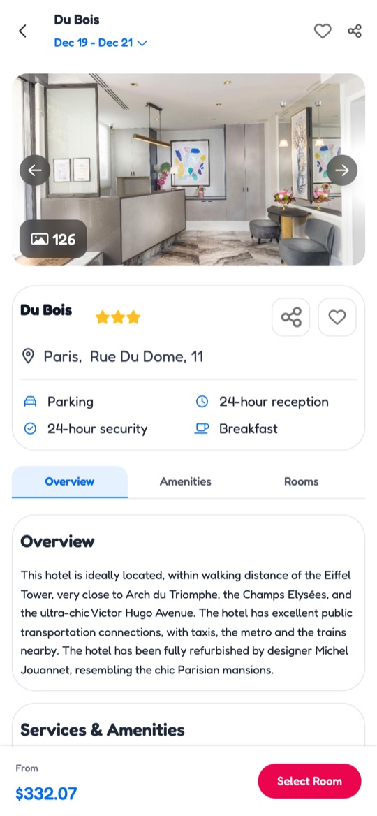
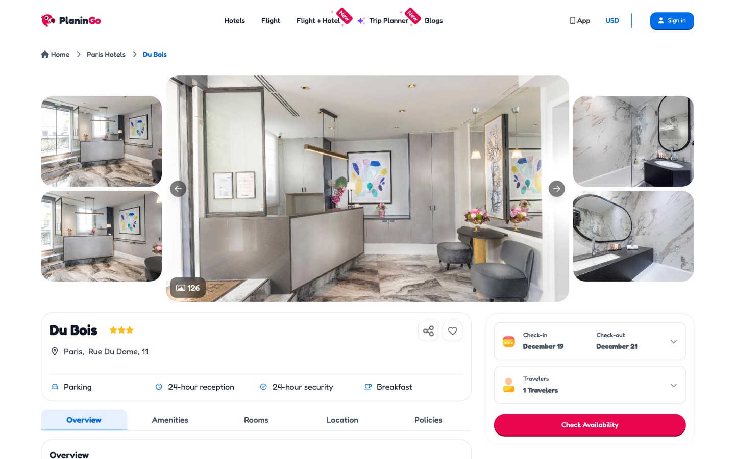
Screens from the live site in November 2026. I left in March 2026, so some details may have changed since.
01The problem
Bring planning, choosing and booking into one experience a traveller can follow, and give operations tools that stay readable as their rules grow.
PlaninGo covers a lot of ground: planning, search, booking, account features and an admin side. Much of the work is the same problem in different places: keeping a long, branching flow understandable when the product behind it has many rules.
For multi-city trips and the admin panel, what mattered most was the order of information, the decisions a person has to make, and the states in between.
02My part
Two years on the traveller-facing product and the operational tools behind it, working with the product and development teams.
Planning and itinerary
- AI trip builder
- Multi-city trips
- Maps and calendar
Search and booking
- Hotel and flight search
- Filters and results
- Detail pages
- Checkout and booking states
Payments and after booking
- Wallet
- Split payment
- Gift cards
- Loyalty and rewards
- Profile and saved items
Operations
- Admin panel
- Reporting
- Service markup rules
Messages around the trip
- Trip invitations and shared-chat messages
- Accepting an invite and what happens next
- Customer-facing and marketing communication
Across the product
- Flows, wireframes, UI, prototypes
- Edge cases
- Handoff and design QA
Exploration
- Planzo, a travel-companion concept
This is what I designed, documented or reviewed, not a list of what each release contained.
03Constraints
Many states in one flow
Search, selection, checkout, booking and post-booking each have success, partial, empty and failed cases. The happy path is the smaller part of the work.
More than one destination
Multi-city trips complicate the itinerary, the map and the calendar, and make the actions that change a trip harder to find.
Rules operations has to manage
Service markup applies at general, hotel and city level. The rules look alike, and an admin has to know which one they're changing.
04Key decisions
One table per kind of markup rule
General, hotel and city rules were easy to confuse in one table. Each kind got its own clearly labelled table, and new rules are added through a dedicated modal, so an admin always knows which rule they're editing.
Make itinerary actions easy to find
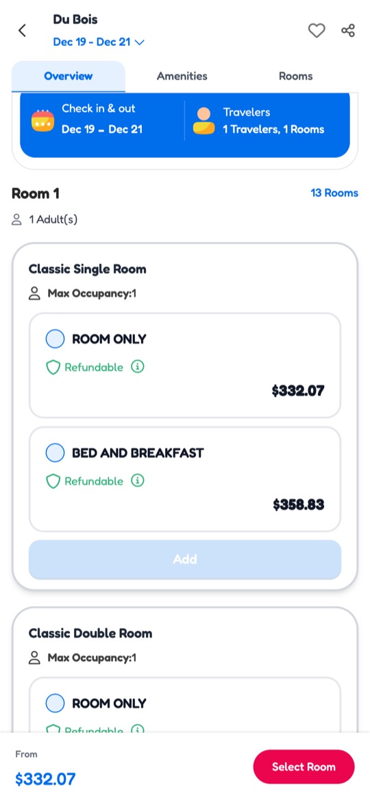
For trips with several destinations I reviewed how discoverable the itinerary actions were and where their buttons sit, so adding or changing a stop doesn't depend on knowing where to look.
Design the states, not only the screens
Search results, checkout and booking each pass through loading, empty, partial and failed states. I documented them next to the main screens, so development built from the whole picture.
Make money rules readable
Wallet balance, a part that can't be withdrawn, fees, gift-card status and paying the rest of a booking each follow business rules. I designed the withdrawal request, the wallet view and split payment so a person can always see what they have, what they can use and what is left to pay.
05Flows
The traveller's journey, end to end, plus the two areas around it.
06Screens
07Status
I designed, documented and handed off these flows, and reviewed them in design QA as they were built.
I'm not quoting conversion, revenue or usage figures: I don't have verified numbers for this work, and I haven't itemised which individual features were released.
I can walk through the full spec and handoff files in an interview.
08What I learned
In a long booking flow, the states between steps (partial results, unavailable options, failed payments) decide whether it feels clear.
Admin tools deserve the same care as customer screens. When rules look alike, labels and structure do most of the work.